First look at the image below and describe the image in 40 seconds. You can record your response using the “Record” button.
myexamenglish.com, pte academic
SAMPLE ANSWER:
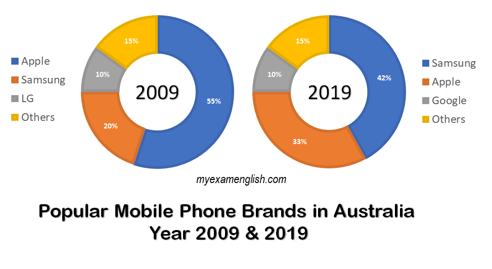
These two graphs compare popular mobile phone brands in Australia during year 2009 and 2019. In year 2009, Apple dominated with more than a half of its market share. Samsung was the second and LG was the third most favorite. While during 2019, Samsung captured almost half of the market. Apple phones became the second most liked and Google got the third place. In conclusion, in the matter of a decade, Samsung became the most popular, and LG brand was replaced by Google phones in Australia.
Q2 Bar Graph
First look at the image below and describe the image in 40 seconds. You can record your response using the “Record” button.
myexamenglish.com, pte academic
SAMPLE ANSWER:
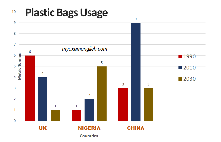
These bar charts compare plastic bags usage in the UK, Nigeria and China during year 1990, 2010 and 2030. The UK used 6 tonnes of plastic bags during 1990, while Nigeria used just 1 tonne and China 3 tonnes. During year 2010, the UK 4 tonnes, Nigeria 2 while China used the highest, 9 tonnes. It is estimated that, in year 2030, the UK will just use 1 tonne, Nigeria 5 and China 3. In conclusion, the UK and China will curb the plastic bags usage in year 2030, while Nigeria will use a lot of plastic bags.
Q3 Bar Graph
First look at the image below and describe the image in 40 seconds. You can record your response using the “Record” button.
myexamenglish.com, pte academic
SAMPLE ANSWER:
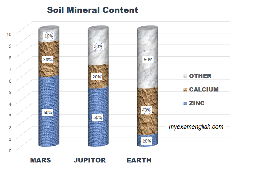
The bar graphs compare mineral content in the soil on Mars, Jupiter and Earth. On Mars, the soil contains most zinc with 60%, calcium 30% and other minerals just 10%. On Jupiter, the soil has 50% of zinc, 20% of calcium and 30% of other minerals. The Earth’s soil has just 10% of zinc, 40% of calcium and 50% of other minerals. In conclusion, the Earth’s soil has the least amount of zinc but it is rich with a variety of other minerals.
Q4 Line Graph
First look at the image below and describe the image in 40 seconds. You can record your response using the “Record” button.
myexamenglish.com, pte academic
SAMPLE ANSWER:
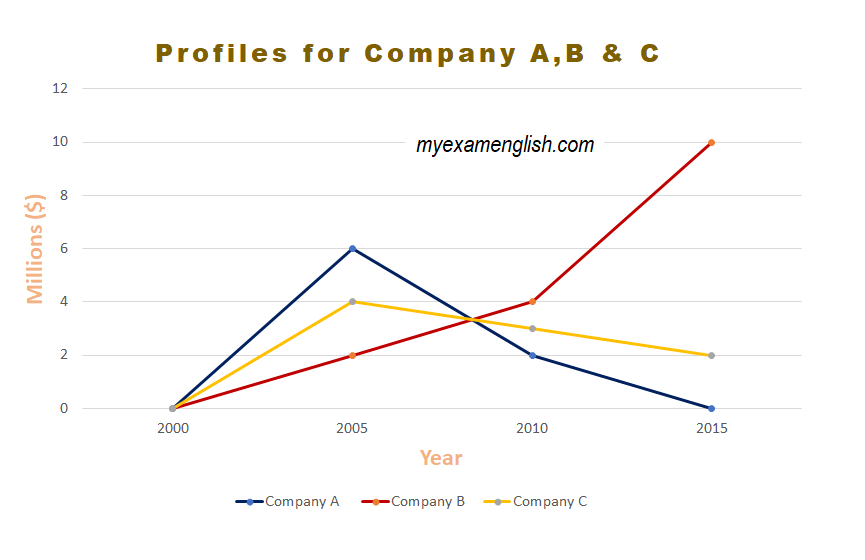
These line graphs compare profiles of the companies namely A, B and C. All three companies started in the year 2000 and during year 2005, company A had the highest value, about 6 million, company C with 4 and company B just 2 million. In year 2010, company A declined to just 2 million, company C to 3 and company B inclined to 4 million dollars. During year, 2015, company A had diminished its value to zero, while company C declined further to 2 million, however company B rocketed to 10 million in its market value. Thus company B was the most and company A was the least profitable for the investors.